Rigorous political analysis for readers who want to understand the system, not just react to it.

Author: Perry Williamson Page 6 of 9

The Unblinking Eye: How Photojournalism Builds the Case for Justice

When a missile tears through a maternity hospital in Mariupol, the first news doesn’t come from a polished government statement. It comes from a photograph—a pregnant woman, bloodied and ghost-pale, being stretchered through a courtyard of rubble. That single frame, shot by an Associated Press photographer, didn’t just report what happened. It burned the reality of war crimes into the global conscience, slicing right past the tidy vocabulary of diplomacy. That’s the job of photojournalism in a war zone: not simply to illustrate history, but to stand as its primary, indisputable witness.

My name is Oksana Danylchenko, and I’ve spent more than a decade studying the intersection of visual media and political accountability in Ukraine. I’ve come to understand something basic: a photograph is never just a photograph. When you’re documenting war crimes, it’s a scrap of forensic evidence, a lever of political pressure, and a permanent answer to anyone who’d rather the truth stay buried under smashed concrete. The photojournalist’s role isn’t passive observation. It’s an active, dangerous, methodical grind of gathering the raw material from which legal and moral judgment eventually gets forged.

Silhouetted photographer capturing smoke rising from a destroyed urban landscape

The Frame as a Legal Instrument

International humanitarian law is a skeleton of definitions. A direct attack on civilians, use of banned weapons, targeting of cultural heritage—these terms demand proof. Written testimony gets disputed. Memory clouds under trauma. A high-resolution digital file, metadata baked in, tells a story that’s a hell of a lot harder to knock down. GPS coordinates, the time stamp, the sequence of frames showing what happened before and after a strike: this is the language investigators speak.

In Ukraine, photojournalists working for Reuters, AFP, and Ukrainian outlets like Ukrinform have turned into accidental forensics experts. They photograph the markings on fragments of cluster munitions. They capture the exact angle of entry wounds on civilian cars. Their work isn’t art, though it can be composed in a way that haunts you. It’s a systematic collection of visual data. We’ve seen these images used by the International Criminal Court, by groups like the Centre for Information Resilience, and by national war crimes units. A photojournalist crawling through the mud of a freshly shelled village in Kharkiv Oblast is laying the groundwork for future indictments.

That’s a heavy load. It demands a technical discipline that goes way past aesthetic instinct. You have to resist the urge to crop out the mundane—a particular street sign, the make of a destroyed tractor—because that detail might be the thing that ties a Russian military unit to a specific location at a specific time. The wide shot of the crater is just as legally weighty as the tight shot of a grief-stricken survivor. The aim is a record so thorough it leaves no room for the plausible deniability that perpetrators scramble for.

A journalist in a helmet and flak jacket kneels to take a photograph among destroyed buildings

Resisting the Fog of Disinformation

Modern war is bullets and pixels at the same time. For every real image of a massacre, there’s a coordinated counter-wave of fake claims: the bodies were staged, the defenders blew it up themselves, the photographer is an actor. This isn’t random trolling. It’s a deliberate state strategy to poison the well of evidence. The photojournalist’s job, then, stretches into verification and authentication. It’s no longer enough to take the picture; you have to preemptively defend its credibility.

That means adopting strict chains of custody. It means grabbing contextual establishing shots that prove a location. It means photographing ID documents, uniforms, and insignia that a casual eye might skip. When the world saw the images from Bucha—bodies with hands bound, civilians shot in the back of the head—the Kremlin’s first reflex was to scream “fake.” What broke through that lie was the sheer, grinding, granular weight of the visual evidence. Multiple independent photographers, working the same streets from different angles, produced a convergent truth that no propaganda machine could plausibly shred. The truth was in the repetition, the awful consistency across thousands of frames.

Let’s be blunt: safety in this profession is a mirage. The Russian military has shown a pattern of targeting journalists. They aren’t seen as neutral observers; they’re threats to the operational security of atrocity. When you look at a photo of a crater next to a vehicle marked “PRESS,” you’re staring at a deliberate act of witness elimination. When a photojournalist still straps on that flak jacket and walks into the grey zone, it’s a defiance rooted in the belief that the historical record is worth the risk of dying.

The Moral Weight of Looking

There’s a psychological price to this work that rarely gets talked about outside the trade. A photojournalist documents a war crime not from a safe remove, but from inside the stench of the aftermath. They stand in the victims’ blood. They frame the anguish of a father holding his dead child. They do it knowing that a well-framed image of a body bag being lowered into a mass grave in Izium carries a political punch that a text report can’t land. The image bypasses the rational brain and hits straight at the empathetic core.

This isn’t exploitation. It’s a form of bearing witness that’s as old as human conflict. The line gets crossed when dignity gets sacrificed for drama. A responsible photographer doesn’t rearrange the scene. They don’t ask a mother to cry louder. They watch, they capture, they transmit. The most powerful war crime photographs are often strangely quiet. A child’s teddy bear coated in dust. A row of wheelchairs abandoned outside a bombed nursing home. A bloodstained passport lying open on a staircase. These images don’t scream; they testify. They say: this was a life, this was an ordinary routine, and this was violently, illegally interrupted.

Black and white photo of a lone press camera on a tripod facing a devastated urban street

The Political Function of Permanent Memory

Governments negotiate. They swap territory, resources, and influence in air-conditioned rooms far from the front lines. Photographs of war crimes mess with that cynical arithmetic. A politician might be willing to write off a missile strike on a railway station as an unfortunate byproduct of conflict, but they can’t so easily ignore a photograph of a severed child’s leg lying next to a pink stroller. The image becomes a political actor in its own right. It creates an obligation. It demands a response that a 500-page human rights report, for all its worth, often fails to trigger.

That’s why photojournalism is a cornerstone of advocacy. When Ukraine’s government presents evidence to international bodies, it leans heavily on the visual record compiled by journalists. The images bridge the gap between the abstract legal term “war crime” and the concrete, undeniable fact of a shattered human body. They force a confrontation. For the public in democratic nations, whose support for military and humanitarian aid is essential, these photographs translate a distant conflict into a moral imperative. A photo of a mass grave in a liberated city doesn’t just document a crime; it documents a failure to stop it, and so builds the political pressure needed to prevent the next one.

There’s a tired argument that the public gets desensitized to violent images. That’s a lazy dismissal. Yes, a single atrocity photo can be absorbed and forgotten in the endless scroll of a news feed. But the cumulative, archived record doesn’t vanish. It sits in databases, in the cloud, in the evidence lockers of The Hague. These photographs wait. They wait for the moment a perpetrator gets arrested at a border crossing years later, and the image of their uniformed figure standing over a bound civilian is pulled from the archive to seal a conviction. The photograph’s power doesn’t fade with time; it hardens into historical fact.

Why the Camera Remains the Sharpest Weapon

In the war in Ukraine, the sheer volume of visual documentation is off the charts. Every soldier has a smartphone. Every survivor films the wreckage. This creates a chaotic, democratized visual record. But it also makes the role of the professional photojournalist more essential than ever. The professional brings context, verification, and narrative coherence to the flood of imagery. They know what to look for. They know how to protect the identity of a victim who fears reprisal. They know how to transmit an image from a bunker when the cell towers are down. They’re specialists in a field where amateurs, however brave, often create evidence that’s legally inadmissible because of broken chains of custody.

To anyone who waves off photojournalism as a secondary sideshow to conflict, I’ve got a simple challenge. Picture the Nuremberg trials without the film reels of the concentration camp liberations. Picture the Srebrenica verdicts without the aerial imagery of the mass graves. Now picture the future tribunals for the architects of the war in Ukraine. The evidence presented won’t be a committee’s summary of events. It will be a photograph. It will be the face of a dead civilian, the debris of a theater used as a shelter, the empty eyes of a survivor. The camera, in the hands of someone with resolve and a sense of purpose, isn’t just a recording gadget. It’s the foundational instrument of accountability.

Frequently Asked Questions

How is photojournalistic evidence treated differently from amateur video in court?

Professional photojournalists follow rigid documentation protocols. Their images carry unaltered metadata—time, date, GPS coordinates—and they keep a secure chain of custody from capture to storage. Amateur footage, while valuable, can be a nightmare to verify if the original file goes missing, gets edited, or is shared through social media platforms that strip metadata. Courts demand a clear, verifiable path from the sensor to the courtroom, and that’s exactly what professional work is built to provide.

Do photojournalists face specific legal risks when documenting war crimes?

Yes. Under international law, journalists count as civilians and are protected from direct attack. In reality, they’re targeted precisely because their work exposes crimes. They also risk legal harassment. A photographer might get slapped with accusations of espionage or propaganda by a hostile state. On top of that, handling imagery of the dead and violated comes with a deep psychological toll, often leading to trauma that the wider industry tends to overlook.

Can a single photograph genuinely influence international policy?

Without question. The photograph of Alan Kurdi, a drowned Syrian toddler on a Turkish beach in 2015, didn’t end the Syrian war, but it jerked European public opinion on the refugee crisis within days. Images of atrocities in Ukraine have directly lined up with surges in public demand for sanctions and weapons transfers. A single frame can wreck a political story about a “clean” war, forcing governments to face a reality they’d rather dodge in favor of diplomatic convenience.

The photojournalist walks the ruins of a bombed apartment block in Dnipro not as a tourist of suffering, but as a collector of truths. Each shutter click is a small, stubborn act against the machinery of denial that always follows atrocity. The work is ugly, painful, and essential. It’s the visual backbone of justice, and without it, the courtroom is an empty stage. The world must not look away, and the photographer must not stop showing them why.


The Unblinking Lens: Why War Crime Photos Are Evidence, Not Art

‘In war, truth is the first casualty.’ We all know the line. But the actual first loss is something narrower: specificity. In the fog of an armed fight, state actors and armed groups spin careful stories, deflections, flat-out denials. A missile strike becomes an “accident.” Mass graves are “staged.” The deliberate targeting of homes and schools vanishes behind the sterile phrase “collateral damage.” That darkness is where a photojournalist does their real work—not as an artist chasing beauty, but as a documentarian collecting evidence. On this blog we pick apart policy through a Ukrainian lens, and few policies are more urgent than making perpetrators answer for what they’ve done. A photograph, used with precision and nerve, turns into an instrument of law.

A war photographer capturing images amid destroyed buildings

The Image as Legal Testimony

For decades, international humanitarian law has wrestled with the same ugly gap: the space between a crime and a courtroom. Witnesses are killed. Memories rot. Physical evidence gets cleared away by the very people who committed the atrocity. One solid frame can slam that gap shut. When we talk about the International Criminal Court or ad hoc tribunals, the picture in most minds is a pile of dry legal briefs. In practice, a photo of a cluster munition tail fin lodged in a school playground—metadata intact—carries forensic weight that a hundred pages of witness statements might never match. It pins down the weapon type, the location, the date, the impact on a protected site.

This isn’t about shock value. The photojournalist documenting war crimes works under a mandate that’s distinct from a combat photographer embedded with a unit. The goal isn’t the drama of a firefight. It’s the silent aftermath: scattered toys, a bloodied textbook, a crater whose dimensions match a specific artillery shell. Images like that are a direct smackdown to the sterilised press releases invading armies pump out. They’re the raw data of a human rights investigation, freezing a moment the perpetrator counted on the world forgetting.

Verification and the Chain of Custody

The go-to attack on photographic evidence is always the same: “Fake.” “Deepfakes.” “Crisis actors.” “Old footage from somewhere else.” These are the rhetorical shields raised by people who are terrified of a sharp lens. That reality forces a change in how serious photojournalists and editors operate today. The job isn’t just clicking the shutter anymore; it’s building an unbreakable chain of custody. You don’t just photograph the subject—you photograph the context. A mass grave image has to include geo-located landmarks, readable signs, architectural details that satellite imagery can cross-reference. The timestamp gets backed up by shadow analysis. The file stays raw, nothing beyond basic colour correction, and moves through encrypted channels so nobody can tamper with it.

In Ukraine, we’ve watched citizen journalists and local stringers, armed with nothing fancier than a phone, adopt these protocols by instinct. They film the serial numbers on downed missiles. They photograph the ID cards of executed civilians lying in the streets of Bucha. That’s not voyeurism. It’s the methodical cataloguing of a crime scene. When a state propagandist claims a massacre was theatre, the rest of us can turn to these verified image archives. The photograph hardens into a fixed point of fact inside a sea of disinformation.

A journalist reviewing forensic photographic evidence on a laptop

The Cost of the Frame

We have to speak plainly about the human price of these files. The person behind the camera is rarely a detached observer. Photographing a child’s body means witnessing the deepest violation of human decency there is. A resolute photojournalist doesn’t turn away—but they don’t walk out whole either. The clinical label “moral injury” can’t touch the visceral nausea of standing in a charred apartment block, smelling smoke and rot, while adjusting the aperture so the light hits the sensor right. That’s the ugly paradox of the work: you have to stay technically sharp enough to produce a usable image while emotionally absorbing a horror that language fails.

The work tends to draw a certain obsessive personality—someone whose need to show the truth overrides the instinct for self-preservation. They wear body armour and helmets marked “PRESS,” but in modern hybrid warfare those markings are often targets, not shields. Killing journalists is a distinct war crime, yet it’s a crime committed with staggering impunity in recent years. Targeting the messenger is a strategic choice by an adversary who understands that a world without images is a world without accountability. When a missile hits a media hub, it’s not a mistake. It’s a deliberate strike against the historical record.

The Slow Burn of the Archive

The hardest truth about war photography is that its power is rarely instant. A front-page shot might stir public outrage for a single 24-hour news cycle before the algorithm scrolls on. The real value of these photographs is archival. They wait, patient and unchanging, until the political weather shifts and justice becomes possible. The Nuremberg trials leaned hard on Allied photographic and film records. The Srebrenica massacre wasn’t proved through testimony alone; it was proved through aerial imagery and exhumation photos that mapped the killing fields. The photojournalist is therefore working for a future they might never live to see, building a body of evidence that will outlast the generals and politicians who gave the orders.

That demands a stubborn fight against the erosion of memory. Digital files are fragile. They can be deleted, corrupted, or drowned in the noise of terabytes uploaded every day. Preserving these images is a policy question in its own right. Governments, museums, international bodies need to fund secure, redundant archives. When a hardline nationalist movement in a perpetrator state tries to scrub history decades later, it’s the existence of these photographic archives that makes denial impossible. The photograph is the enemy of revisionism.

A war zone investigator holding a camera amidst rubble

The Ethical Line: Witness vs. Intervention

A question that stalks every conflict photographer is the boundary between documenting and intervening. When you frame a wounded civilian in your viewfinder, why aren’t you dropping the camera to apply a tourniquet? It’s a question that demands an honest answer, stripped of artistic pretence. The answer is usually a division of labour. The photojournalist is rarely alone; medics, rescue workers, soldiers are often right there. The journalist’s specific, specialised contribution to saving that life lies in showing the world the mechanism of the injury—the banned shrapnel, the illegal incendiary device—so that future lives get spared. It’s a cold calculation, but a necessary one.

There’s a red line, though. A photographer who stages a scene, or who delays relief for the sake of a “better” composition, has crossed from documentation into exploitation. That’s why the most credible conflict photographers stick to tight internal codes. They don’t move bodies. They don’t ask a grieving mother to repeat her scream for the lens. They capture what’s there, with a fidelity that’s almost mechanical. The dignity of the victim has to be preserved even while documenting their violation. A photograph that humiliates a dead civilian serves the enemy, feeding a narrative of dehumanisation. A photograph that restores the victim’s identity—showing the family photo album before the burned-out building—indicts the killer.

Policy Implications: Funding the Watchmen

From a policy analysis angle, we have to talk about the economic fragility of this field. Freelance photojournalists routinely fund their own trips into active war zones, selling images to an industry that pays ever-shrinking day rates. This is a scandal. A democracy that benefits from the exposure of war crimes but leaves its visual documentarians without insurance, legal backing, or a living wage is failing in its duty. Subsidised grant programmes, paid for by democratic governments, should treat photojournalism not as arts funding but as a component of national security and human rights enforcement. A freelancer with a Leica and a flak jacket is a more effective deterrent to illegal airstrikes than a dozen sternly worded diplomatic notes.

Publishers, too, have to resist the urge to sanitise. The polite instinct to crop out the blood or blur the face of a dead child often serves the perpetrator, not the public. It softens the reality of a policy decision to launch an invasion. Editors have to weigh the trauma of their audience, sure, but they also have to ask themselves whether the viewer’s discomfort is a valid reason to hide a crime. The raw, unmanipulated image of violence is a democratic necessity. It forces a citizen to confront what’s being done in their name or, just as sharply, what’s being done to their allies while they stand idle.

FAQ: Photojournalism and War Crimes

How can a photograph prove a war crime in court?

A photograph works as demonstrative evidence. To get admitted in tribunals like the International Criminal Court, the prosecution generally needs to establish its authenticity through a witness—usually the photographer—who can testify to the date, location, and the fact that the image hasn’t been materially altered. The image has to show a violation of international humanitarian law, such as deliberately targeting civilians or protected objects. Modern verification methods—reverse image searches, metadata analysis, cross-referencing with satellite data—all strengthen the photograph’s probative value.

What’s the difference between war photography and human rights documentation?

These fields overlap but have different primary aims. Combat photography often zeroes in on the tactical dynamics of battle and the experience of soldiers. Human rights documentation—the approach most relevant to war crimes—focuses on the consequences of conflict for non-combatants. It puts evidence ahead of aesthetics. The framing is wider to show context, the captions are forensic, and the intent is to build a legal and historical record rather than capture a dramatic action shot.

Why do photojournalists risk their lives for these images?

Most conflict photojournalists work under a heavy sense of moral obligation. They understand that perpetrators of mass violence rely on secrecy and confusion. The camera breaks that secrecy. By risking physical harm, they make sure the victims aren’t wiped from history and that the machinery of international justice gets the raw material it needs to function. It’s a calculated risk taken to bridge the gap between a distant tragedy and global awareness.

The lens isn’t a neutral tool. In the hands of a resolute documentarian, it’s a weapon of accountability, a shield for truth, and a witness you can’t bribe or intimidate. As long as war crimes get committed in the shadows, there will be people who walk into those shadows, armed with nothing but a camera, to drag the facts into the light.

How Photography Documents What Policy Reports Cannot

The Gap Between Data and Reality

Policy reports arrive with weight. They carry the authority of institutions, the precision of statistics, the credibility of peer review. They tell you that 6.5 million people are displaced. They tell you inflation reached 26.6%. They tell you infrastructure damage costs $435 billion. And yet, something remains missing from every one of these documents — the thing that makes a reader understand rather than merely know.

Photography fills that gap. A single frame from Bucha, from Mariupol, from Kharkiv does what no white paper can: it forces the viewer to confront the human consequence of policy failure, policy delay, or policy complicity. At ukrfoto.net, we have spent years examining this tension — the distance between what reports document and what images reveal.

Photographer documenting conflict aftermath with camera

What Numbers Conceal

A policy report on housing destruction in eastern Ukraine will give you square meters lost, buildings damaged, reconstruction estimates. These are necessary figures. They serve planning, budgeting, and diplomatic negotiation. But they do not show you the kitchen where a family once cooked dinner, now open to the sky with a shell hole through the wall above the stove. They do not show the child’s shoe in the rubble.

Photography does. It refuses abstraction. When Evgeniy Maloletka captured the maternity hospital bombing in Mariupol on March 9, 2022, no one needed a statistical annex to grasp what had happened. The image traveled worldwide within hours. It generated political pressure that reports spanning hundreds of pages had failed to produce over years. That is not a coincidence. It is the fundamental advantage of visual documentation.

Reports Explain. Photography Testifies.

There is a difference between explanation and testimony. A report explains the what and how — casualty counts, weapons systems used, timeline of events. A photograph testifies. It says: I was here. This happened. Look at it. This is why photographic evidence has been admitted in war crimes tribunals from Nuremberg to The Hague. The image does not interpret; it presents. The viewer must then reckon with what they see.

This distinction matters now more than ever. In an era of information warfare, where official narratives compete with disinformation, the photograph retains a stubborn authenticity. Yes, images can be manipulated. Yes, context can be stripped away. But the photographic record — particularly when produced by trained, ethical documentarians — resists the kind of casual distortion that plagues text-based propaganda. A burned-out apartment building is a burned-out apartment building. No policy briefing can explain it away.

Documentary photographer reviewing images on camera display

Historical Proof: Images That Changed Policy

The historical record is clear. Photography has repeatedly forced policy shifts that pure data could not achieve.

Consider Lewis Hine’s photographs of child laborers in American factories. Statistics about child labor existed before Hine began his work in 1908. Congress had data. Reformers had compiled reports. But it was Hine’s images — small boys standing beside massive machinery, girls with exhausted faces in textile mills — that built the public demand leading to the Keating-Owen Act of 1916. The law was later struck down, but the visual record persisted, and eventually contributed to the Fair Labor Standards Act of 1938, which effectively ended child labor in the United States.

Consider Nick Ut’s photograph of Kim Phúc running from a napalm attack in Vietnam in 1972. The Pentagon had produced volumes of reports justifying the war. Military briefings provided casualty figures and strategic assessments. But that one image — a nine-year-old girl, burned, running toward the camera — did more to erode American public support for the conflict than any congressional hearing.

Consider the photographs from Abu Ghraib in 2004. The Taguba Report documented systematic abuse. It was thorough and damning. But it was the photographs — the visual proof of humiliation and torture — that generated international outrage and forced accountability. Words described what happened; images made it undeniable.

The Pattern Is Consistent

In each case, reports existed first. In each case, the reports failed to produce adequate policy response on their own. The images broke through because they bypassed the intellectual processing that reports require and struck directly at human recognition. You can read about torture and file it away. Seeing it is different.

Why Reports Fall Short

This is not an argument against policy reports. They remain essential. No photograph can tell you the fiscal impact of reconstruction or the logistical requirements of refugee resettlement. But reports have inherent limitations, and we should acknowledge them honestly.

Reports create distance. The very format — executive summary, methodology, findings, recommendations — encourages detachment. The reader engages analytically. The subject becomes a case study. This distance is by design; objectivity demands it. But objectivity without empathy produces policy that is technically sound but politically unsustainable.

Reports are slow. A thorough assessment takes months or years. By the time a report on civilian casualties in a conflict zone is published, the news cycle has moved on. Political will has evaporated. Photography operates at the speed of the event. The image arrives while the wound is still open.

Reports are easy to bury. A 200-page document can be released on a Friday afternoon, ignored by media, and forgotten. An image cannot be buried so easily once it circulates. It replicates. It appears in feeds, on posters, in protests. It refuses to stay quiet.

Camera equipment and documentary photography setup

The Responsibility That Comes With the Lens

If photography carries this power, then photographers carry a corresponding responsibility. The camera is not neutral. The act of framing is an act of selection — choosing what to include and what to leave out. The choice of angle, timing, and context shapes the narrative as surely as any editorial decision.

This is why ethical documentation matters. Photographers working in conflict zones and crisis situations must adhere to standards that respect the dignity of their subjects while refusing to soften the truth of what they witness. Consent matters when possible. Attribution matters always. Context matters absolutely. An image without context can be weaponized as easily as it can bear witness.

At ukrfoto.net, we have argued consistently that the photographer’s first obligation is to the subject, not to the audience, not to the publication, and not to any political position. This means showing reality as it is — not as any party wishes it to be. When a government bombs its own cities, the photographer records the destruction. When that government’s opponents commit abuses, the photographer records those too. The camera does not take sides. It takes pictures.

What Must Change

Policymakers and institutions need to stop treating photography as mere illustration. Photographs are not decorations for report covers. They are primary evidence. They should be integrated into policy analysis with the same rigor applied to quantitative data.

This means several concrete shifts:

First, photographic evidence should be systematically archived alongside written documentation in conflict and crisis records. The United States Holocaust Memorial Museum understood this decades ago — its visual history archive is as essential as its textual records. The same approach should apply to contemporary documentation efforts.

Second, policy reviews should include visual analysis. When assessing the impact of a humanitarian crisis or a military campaign, the photographic record should be examined with the same seriousness as economic indicators. What does the visual evidence show about conditions on the ground? What do the images reveal that the data cannot?

Third, photographers should be protected as documentarians, not dismissed as activists. In too many contexts, those who photograph state violence are harassed, detained, or killed. According to the Committee to Protect Journalists, at least 67 journalists and media workers were killed in 2022, many of them photographers and videographers. Their work is not propaganda. It is documentation, and it deserves legal protection.

The Image Endures

Reports get shelved. Statistics become outdated. Policy recommendations are implemented or ignored, and then replaced by new reports with new recommendations. The photograph endures. It sits in archives, in textbooks, in collective memory. Long after the policy debates have faded, the image remains — demanding that future generations look, and remember, and understand what happened.

This is photography’s unmatched contribution to political and policy analysis. Not replacement of reporting, but completion of it. The report tells you what occurred. The photograph makes you feel it. Both are necessary. Only the photograph ensures you cannot look away.


FAQ

Can photography be objective enough to inform policy?

No single photograph is fully objective — framing, timing, and selection all involve human judgment. But the same is true of any research methodology. Objectivity in documentation comes from standards, transparency, and corroboration. When multiple photographers working independently produce images that confirm the same conditions, the combined visual record achieves a reliability that policy processes can and should use.

Why do images create stronger public reactions than statistics?

Human cognition processes visual information differently than abstract data. Neuroscience research consistently shows that images activate emotional and empathetic responses more directly than text or numbers. This is not a weakness — it is how people make sense of suffering and consequence. A statistic communicates scale; an image communicates experience. Both are necessary for informed public discourse.

How can policymakers use photographic evidence responsibly?

Responsible use means treating photographs as evidence rather than propaganda. This requires verifying the source, date, and location of images, providing proper context, and avoiding selective use that distorts the overall situation. Policymakers should consult photographic archives alongside written assessments and should resist the temptation to use images only when they support a predetermined position.

How Photography Documents What Policy Reports Cannot

How Photography Documents What Policy Reports Cannot

Policy reports arrive with citations, methodology sections, and executive summaries. They carry weight in parliamentary chambers and diplomatic briefings. Yet something remains absent from their pages — the face of a child standing in a bombed corridor, the trembling hands of a grandmother clutching a plastic bag of belongings, the empty school desk where a student sat yesterday. Photography fills this void. It forces witnesses to confront what statistics sanitize and what official language obscures.

Protesters holding signs during a demonstration

The Limits of Policy Language

Policy documents operate by design in the register of abstraction. A United Nations report on displaced persons will state that 6.5 million individuals fled their homes. The number carries information. It does not carry experience. The same report will note “significant infrastructure damage” across multiple regions. That phrase covers hospitals reduced to concrete dust, schools with no roofs, and water treatment plants that no longer treat anything. The language serves bureaucratic necessity. It fails human necessity.

I have read hundreds of these documents. Each one follows a familiar architecture: context, findings, recommendations. The structure is intentional and repeatable. It allows comparison across years and conflicts. However, repeatability breeds numbness. When a reader encounters “civilian casualties” for the fiftieth time, the phrase loses its teeth. Photography restores those teeth. A single image of a father carrying his daughter through rubble does what 200 pages of analysis cannot — it makes the viewer feel the weight of that child.

What the Camera Captures That Text Cannot

Immediate Emotional Truth

Photography operates at the level of gut reaction before rational analysis begins. When Evgeniy Maloletka captured the aftermath of the Mariupol theater bombing, no one paused to check methodology. The image hit first. Then came the questions, the verification, the political arguments. That initial impact matters. Policy reports ask readers to think. Photographs make readers see, and seeing precedes thinking in human cognition.

This is not an argument against analysis. Analysis remains essential. But analysis without emotional comprehension becomes an exercise in detachment. Photographs force proximity. They deny the reader the comfort of distance that bureaucratic language provides.

Specificity Over Generalization

Reports aggregate. Photographs particularize. A refugee policy document will describe “population movements” and “shelter needs.” A photograph shows one family in one tent with one blanket between them. The general and the specific are both true, but they are different kinds of truth. Policy needs the general. Justice needs the specific.

Crowd gathered during a public demonstration

Historical Precedent: Images That Shifted Policy

The historical record is clear on this point. Photographs have altered policy trajectories in ways that companion reports never managed. Amnesty International has documented how images of torture at Abu Ghraib forced legislative action in mere days, while preliminary reports on the same facility had circulated for months without meaningful response.

Consider the Vietnamese girl running from napalm in 1972. The image did what no Pentagon briefing could: it made the war’s human cost undeniable. The photograph did not replace policy analysis. It made policy analysis unavoidable by confronting citizens with visual evidence they could not rationalize away.

More recently, images of Alan Kurdi — the three-year-old Syrian boy whose body washed ashore in Turkey — forced European leaders to reconsider refugee policy within 48 hours. Prior reports on Mediterranean drownings had generated no comparable urgency. The numbers were known. The photographs made those numbers intolerable.

Photography as Evidentiary Documentation

Counter-Narrative Function

Authoritarian regimes understand photography’s power, which is why they work to control it. When Russian officials denied targeting civilian infrastructure in Ukraine, photographs of destroyed apartment blocks, shopping centers, and maternity wards provided direct counter-evidence. Policy reports can cite satellite data and forensic analysis. Photographs show what that data means in human terms — a kitchen with no wall, a bedroom open to the sky, a playground cratered beyond use.

This counter-narrative function extends beyond conflict. Environmental degradation, labor exploitation, and systemic neglect all produce conditions that official accounts minimize. Photographs make minimization difficult. They anchor claims to visible reality in ways that disputing requires disputing reality itself.

Archive and Accountability

Photographs create a temporal record that resists revision. When conditions improve or worsen, comparative images document the change with a directness that longitudinal reports struggle to match. A 2021 street scene compared with a 2023 street scene tells a story that paragraphs of economic indicators approximate but cannot show.

The Committee to Protect Journalists has tracked how photographic documentation contributes to accountability processes in post-conflict tribunals. Images entered into evidence carry weight that textual testimony alone does not. A witness can be challenged on memory. A photograph can be challenged on context, but not on whether the scene existed.

The Problem of Access and Selectivity

Honesty demands acknowledging photography’s limitations. Photographers choose what to frame. Editors choose what to publish. Distribution networks choose what reaches audiences. Each selection point introduces bias. A photograph of devastation can mislead if it omits recovery. A photograph of resilience can mislead if it obscures ongoing suffering.

Policy reports have their own selection biases — which data to collect, which methodology to apply, which recommendations to prioritize. Neither medium is neutral. The difference is that photography’s biases are visual and therefore more readily identified. A viewer can spot what is outside the frame. A reader cannot easily identify what a report chose not to measure.

The access problem remains real. Photographers enter spaces that foreign policy analysts often cannot, but they also face restrictions that satellites do not. Conflict zones, closed borders, and government prohibitions limit what cameras capture. The resulting record is partial. It is, however, partial in ways that complement the partial record of policy documentation. Together, they produce a more complete picture than either could alone.

Person holding camera documenting a scene

Digital Circulation and Its Consequences

The speed of digital image circulation creates both opportunity and risk. Photographs now reach global audiences within minutes. This immediacy can mobilize rapid response, as seen with images from Bucha in 2022. It can also spread misattributed or manipulated content. Verification procedures — reverse image searches, metadata analysis, cross-referencing with satellite data — have developed in response. These procedures are imperfect but improving.

Policy reports undergo review processes that slow publication but increase reliability. The trade-off between speed and verification is real. Photography operates at speed. Policy operates at deliberation. Each has value. Neither is sufficient alone.

What This Means for Policy Practitioners

Policy professionals who ignore photographic evidence are working with an incomplete dataset. This is not sentimentality. It is epistemological rigor. If a policy recommendation addresses human conditions, then evidence of those conditions — visual, textual, statistical — all belong in the analytical process.

Practical steps follow from this recognition. Policy teams should include photographic documentation in their evidence reviews. Report authors should reference visual records alongside statistical data. Training programs for policy analysts should develop visual literacy alongside quantitative and legal analysis skills. The United Nations has increasingly integrated photographic evidence into its documentation processes, recognizing what independent journalists and photographers have long demonstrated.

The Irreducible Witness

A policy report says that 40 percent of housing in a district was destroyed. A photograph shows what 40 percent destruction looks like from the street where families once lived. Both statements are factual. They are not equivalent. The number informs. The image confronts. Policy needs both — information to design interventions and confrontation to sustain the political will that interventions require.

Photography documents what policy reports cannot because it operates in a register that policy deliberately avoids: the specific, the emotional, the immediate. This is not a flaw in policy. It is a feature. Policy requires abstraction to function across cases and contexts. But abstraction without grounding produces policy that addresses statistical categories rather than human beings.

The camera returns human beings to the equation. That is its irreplaceable contribution. It does not replace analysis, verification, or deliberation. It provides the raw material of witness that makes those activities matter beyond bureaucratic procedure. A policy recommendation that no one reads changes nothing. A photograph that no one can forget changes everything.

Frequently Asked Questions

How can policy professionals verify the authenticity of photographic evidence?

Verification requires multiple approaches: metadata analysis of image files, reverse image searches to confirm origin and date, geolocation techniques using visible landmarks and shadows, and cross-referencing with satellite imagery. Organizations like Bellingcat have published detailed methodologies. No single technique is definitive. Corroborating multiple indicators builds confidence in authenticity.

Does photographic evidence carry legal weight in international proceedings?

Yes. International tribunals, including the International Criminal Court, admit photographic evidence alongside testimony and documentary evidence. Photographs must meet admissibility standards — authentic origin, chain of custody, relevance to charges. They do not replace testimony but can corroborate it or establish conditions that written evidence alone cannot demonstrate.

What ethical considerations govern the publication of photographs from conflict zones?

Several principles apply. Consent from subjects when possible and safe to obtain. Minimizing harm to vulnerable individuals, particularly children. Avoiding gratuitous display of the dead. Providing context rather than presenting images without explanation. Respecting the dignity of subjects. These principles sometimes conflict — newsworthiness versus potential harm — and require case-by-case judgment rather than rigid rules.

What the Camera Sees That Policy Reports Cannot

Between the Spreadsheet and the Street

Policy reports arrive bound, footnoted, and formatted in institutional fonts. They quantify displacement in percentages, chart food insecurity in colored graphs, and summarize conflict deaths in appendices. These documents serve a purpose. They inform legislative debate and guide funding allocation. But they leave out what matters most: the specific weight of a destroyed home, the expression on a face that has just learned of a loss, the texture of a road cratered by artillery. Photography captures what no white paper can convey.

Documentary photographer reviewing images on camera screen in the field

I have spent years examining how visual documentation intersects with political accountability. The pattern is consistent. Reports describe; photographs show. A casualty figure of 10,000 reads one way. A photograph of one person grieving over another reads entirely differently. Both are true. Only one stays with you.

The Limits of Policy Language

Policy reports rely on aggregation. They must. A 200-page document assessing humanitarian conditions in eastern Ukraine, for instance, will state that X% of housing stock has been damaged and Y% of residents lack reliable heating. These numbers are accurate and necessary. But they are also abstract by design. Aggregation erases the individual.

When a report notes that 1.5 million people have been internally displaced, a reader understands the scale. A photograph of one family carrying plastic bags across a frozen field communicates something else entirely: the indignity, the urgency, the cold. The report gives you the dimensions of the crisis. The photograph gives you its reality.

This is not a criticism of policy writing. It is a recognition of its boundaries. Language that generalizes serves institutional decision-making. But institutions are not the only audience that matters. Citizens, journalists, historians, and the affected communities themselves deserve access to what happened, not just to what can be counted.

The Abstraction Trap

Consider how often policy documents use passive construction. “Communities were affected.” “Infrastructure was degraded.” “Populations faced hardship.” These phrases are accurate but bloodless. They strip agency and obscure cause. A photograph of a collapsed school does not allow passive evasion. You see the destruction. You ask why. The image forces a question that the report has already softened.

Camera lens focused on documenting reality in challenging conditions

Photography as Evidence

Photographs function as evidence in ways that reports cannot. A war crimes investigation depends on visual documentation because testimony alone is vulnerable to dispute. The image of Bucha’s streets in April 2022, bodies visible where they fell, entered the global record with an immediacy that no text summary could match. Policy reports would later quantify the deaths. The photographs established what happened first and with undeniable force.

The International Criminal Court and various United Nations commissions of inquiry rely on photographic evidence precisely because it resists linguistic manipulation. A photograph can be staged or misattributed, but it cannot be summarized into vagueness. It remains specific, anchored to a moment and a place. This specificity is its evidentiary power.

Photojournalists working in conflict zones operate under threat to produce this evidence. They are not supplements to policy researchers. They are primary documentarians, creating records that investigators, legislators, and courts will depend upon for years. The image arrives before the report. The image outlasts the report.

Historical Precedent

History offers clear examples. Lewis Hine’s photographs of child laborers in American factories did what no factory inspection report had accomplished: they made the exploitation visible and immediate. Politicians had read statistics about child labor for decades. They acted only when the public saw Hine’s images and could no longer look away.

The Vietnam War’s visual record shifted American public opinion more decisively than any Pentagon briefing. Eddie Adams’s photograph of a Saigon execution, Nick Ut’s image of Kim Phúc running from napalm, these frames entered political discourse with a force that policy analysis never achieved. The military’s own reporting, voluminous and detailed, could not compete with what the camera revealed.

More recently, photographs from Abu Ghraib prison in 2004 exposed detainee abuse that official military reports had either minimized or concealed. The images did not merely document; they detonated. They forced investigations, resignations, and legal proceedings that written complaints from within the system had failed to trigger.

The Human Element Policy Ignores

Policy reports are written in the language of the institution. They must remain composed, measured, and defensible. Photography operates under no such constraint. A photograph can show fear, exhaustion, rage, or grief without needing to justify its emotional register. It does not editorialize. It presents.

Person walking through damaged urban landscape documenting aftermath

When I review documentation from Donetsk, Luhansk, Kherson, or Mariupol, the reports tell me about structural damage percentages, utility restoration timelines, and population movement estimates. The photographs tell me that a woman stood in the rubble of her kitchen holding a single intact plate. Both facts matter. Only one will make someone outside the conflict zone understand what war actually does to a life.

This emotional dimension is not a rhetorical flourish. It is a documentary function. Accurate representation of conflict includes representing its emotional impact. To exclude that dimension is to produce an incomplete record, one that serves administrative convenience rather than truth.

Contemporary Documentation Challenges

Digital manipulation and misinformation have complicated photography’s evidentiary role. Deepfakes and staged images circulate rapidly. This challenge demands more rigorous verification standards, not less photography. Organizations like Bellingcat and the United Nations Human Rights Office’s commissions of inquiry have developed sophisticated methods for authenticating visual evidence, including metadata analysis, geolocation, and chronolocation.

The response to potential manipulation should not be to retreat into text-only reporting. It should be to strengthen documentation practices, train more visual journalists, and build verification infrastructure. The photograph remains the most direct record of what occurred. We must protect its integrity, not abandon it.

Citizen photography has also changed the landscape. When residents photograph incoming missile strikes, damaged infrastructure, or military movements, they produce real-time documentation that professional journalists cannot always access. These images, when verified, supplement official reporting with an immediacy and geographic specificity that institutional reports lack. They also return documentary agency to the people most affected by policy failures.

What Must Change

Policy institutions should integrate visual documentation directly into their reporting frameworks. Currently, photographs appear as occasional illustrations in appendices, if they appear at all. This approach treats images as decorative rather than documentary. Every major policy report on conflict, displacement, or infrastructure damage should include a visual record produced by photographers with direct access to the affected areas.

Funding structures must also shift. International organizations commission reports at enormous expense while visual journalists operate on shrinking budgets. The resulting documentary record is impoverished. If we value evidence, we must fund the people who produce the most direct form of it.

Archiving practices require reform as well. Policy reports enter institutional databases with reliable metadata and long-term preservation guarantees. Photographs often languish in personal archives or disappear when news organizations restructure. A photograph that cannot be found is a photograph that cannot serve as evidence. We need dedicated, funded archives for conflict and policy photography, with standards that match those applied to textual records.

FAQ

Why can’t policy reports simply include more photographs?

They can and should. But the issue runs deeper than layout. Institutional culture treats text as primary evidence and images as supplementary. Including photographs without changing this hierarchy means they remain decorative. Photographs must be treated as evidence in their own right, with captions, context, and attribution given the same editorial rigor applied to text. The visual record should be integrated throughout the document, not isolated in an appendix.

How do photographers maintain objectivity when documenting politically charged situations?

No document, textual or visual, achieves pure objectivity. Photographers make decisions about framing, timing, and subject. Policy analysts make comparable decisions about methodology, data selection, and emphasis. The question is not whether bias exists but whether it is transparent. Ethical photographers disclose their position, avoid staging, and present images with accurate context. The resulting photograph, with its limitations acknowledged, remains a more direct record than any summary can provide.

What role does citizen photography play when professional photojournalists cannot access conflict zones?

Citizen photography has become essential to contemporary documentation, particularly in besieged or inaccessible areas. Residents photograph events as they happen, providing timestamps and geolocation data that later verification can confirm. These images carry risks: untrained observers may face retaliation, and verification standards are harder to enforce. But the alternative, no visual record at all, is worse. The solution is to train citizen documentarians in secure practices and to build verification systems that can assess their output alongside professional work.

The Record We Deserve

A society that records its crises only in aggregates and percentages has chosen amnesia dressed as precision. The numbers are correct, but they are incomplete. The photograph completes them. It insists on the specific, the individual, the irreducible reality that no database can capture.

We do not need fewer policy reports. We need visual documentation recognized as equal in evidentiary weight. We need funding structures that support photojournalists alongside analysts. We need archives that preserve images with the same care given to text. And we need readers, legislators, and investigators willing to look at what the camera reveals, even when what it reveals demands more than a footnote can contain.

The camera sees what policy cannot. We should pay attention.

Project 2025 in Practice: What One Year of Executive Orders Actually Changed

The Paperwork Explosion Nobody’s Talking About

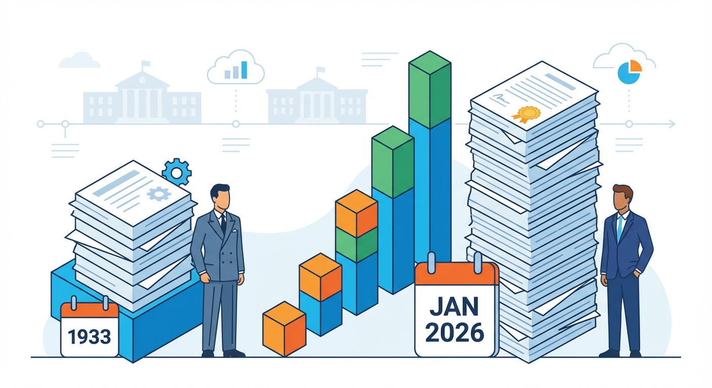
Let’s start with the raw numbers because they matter. By January 2026, the Trump administration had signed over 140 executive orders in its first twelve months. That’s not hyperbole. That’s not spin. That’s historical precedent getting lapped. According to the American Presidency Project executive order database, you have to go back to Franklin Roosevelt’s first year to find a comparable velocity. FDR was governing through the Great Depression. He had active congressional buy-in. He was operating in a genuinely different constitutional moment.

Project 2025 in Practice: What One Year of Executive Orders Actually Changed

Here’s where it gets interesting: this wasn’t just an executive order binge. This was a methodical implementation campaign. The Heritage Foundation’s Project 2025, that 900-page policy document that became the second Trump administration’s operational bible, got cited as direct inspiration or basis for at least 60 of those actions. That’s according to ProPublica’s meticulous tracking, available in their federal policy change tracker. Sixty documented instances. Not speculation. Not inference. Direct attribution.

What does that mean in practice? It means policy wasn’t being made in the moment. It was being executed from a blueprint that existed before the administration took office. Which raises the actual question worth asking: who wrote the blueprint, and what incentives got baked into it?

Illustration for Project 2025 in Practice: What One Year of Executive Orders Actually Changed

The Schedule F Reclassification: How Federal Workers Lost Their Seats at the Table

This is where things got genuinely structural. By mid-2025, approximately 24,000 federal employees had been reclassified under Schedule F. That’s a technical term for something profound: the removal of civil service protections that had existed since the Pendleton Act of 1883. These weren’t senior political appointees. These were mid-level career employees. Scientists. Compliance officers. People with institutional memory.

Schedule F reclassification matters because it stripped merit-based protections and made these jobs subject to at-will employment. Translation: you can get fired because your boss doesn’t like your policy advice. You can get fired because you flagged a regulatory problem. You can get fired because you’re not politically aligned with the new administration.

The incentive structure embedded in this policy is worth naming directly. When you remove job protections from career civil servants, you change who stays in government. You don’t get cautious, experienced administrators. You get loyalists. You get people who understand that their job security depends on alignment, not competence. That’s not conspiracy. That’s organizational behavior. That’s what happens when you restructure incentives.

The Courts Started Pushing Back. Here’s What That Tells Us.

Eighty-three federal judges across multiple districts had issued over 90 nationwide injunctions against executive orders within the first twelve months. Georgetown Law Center on Congressional Studies confirmed it: that’s the highest single-year count in modern judicial history. We’re not talking about one judge disagreeing. We’re talking about a systematic pattern of legal resistance.

Now here’s the thing about federal judges, they’re not activists. They’re institutional conservatives. They care about jurisdictional limits. They care about established law. When you get 90 injunctions in a year, you’re seeing something different. You’re seeing courts concluding that executive authority has extended beyond its constitutional boundaries.

Which orders faced challenges? The ones that tried to defund federal agencies unilaterally. The ones that attempted to strip regulatory authority from career staff. The ones that rewrote enforcement priorities without statutory basis. The ones that assumed presidential power extends further than precedent allows.

The Political Price: It’s Showing Up in the Polling

A January 2026 Gallup poll gave the administration a 44% approval rating. That’s not shocking by itself. What’s actually interesting is the independence problem. Sixty-one percent of independents expressed concern about the pace of changes to federal institutions. That’s the coalition-building problem. That’s the warning sign.

Because here’s what we know about sustainable change in government: it requires some degree of institutional buy-in beyond your base. It requires people who didn’t vote for you to say, “Okay, this is change I can live with.” Sixty-one percent of persuadable voters saying they’re concerned about the pace and scope of institutional change? That’s a constraint. That’s a ceiling.

The Follow-the-Money lens here reveals something important. The Trump administration had a specific coalition backing Project 2025. The Heritage Foundation had skin in the game. Conservative funders had expectations. Corporate interests aligned with deregulation had seats at the table. When you’re executing a blueprint written by those constituencies, you’re not writing policy in response to changing conditions or broad consensus. You’re fulfilling contractual expectations. You’re honoring commitments made before anyone voted.

What This Means for You and How to Actually Track It

Here’s my honest take: understanding this matters not because you should feel outraged or vindicated depending on your politics. It matters because governance works better when citizens understand how incentives shape outcomes. It matters because democracy requires people who can read the receipts.

Start here. Go to that American Presidency Project database I linked. Look at the executive orders chronologically. Pick three that interest you. Then search for what happened next. Did courts block them? Did Congress respond? Did agencies implement them or find workarounds? Then ask: who benefits from this change? Who loses? What problem was this supposedly solving, and is there evidence it actually solved it?

This is what engaged citizenship looks like. Not anger. Not despair. Not blind loyalty. Just disciplined attention to the actual mechanisms of power and the actual consequences of policy. That’s how you become the person in the room who actually understands what’s happening.

How Trump’s April 2025 Tariff Blitz Rewired Global Trade Overnight

April 2nd: The Day Trade Rules Got Rewritten

Let’s set the scene. April 2, 2025. President Trump signed executive orders that fundamentally altered how America conducts international commerce. This wasn’t a gradual policy shift or a negotiating opening bid. This was a systemic redesign, announced with the kind of executive decisiveness that makes legislative bodies nervous and markets reactive.

The architecture was straightforward in its ambition: a baseline 10% tariff on virtually all imports, with China-specific duties climbing to 145%. Think of it as a tiered pricing system. You’re setting a floor for every trading partner while creating specific pressure points for strategic adversaries. The President framed it as “reciprocal tariffs” – the idea being that if other nations tax American goods, America taxes theirs accordingly. Sounds fair on paper. Implementation tells a different story.

What matters for understanding this moment is recognizing that these weren’t negotiated agreements or trade deal concessions. These were executive actions. That distinction matters because it bypassed traditional Congressional trade authority debates and landed immediately into the global economy like a stone in still water.

The Economic Shock: What the Numbers Actually Meant

Here’s where the civic education part gets real. When economists talk about tariffs, they’re not just discussing international business abstractions. They’re talking about your grocery bill, your car payments, and your neighbor’s job prospects.

The Peterson Institute tariff impact analysis estimated that the average American household would lose approximately $2,600 in annual purchasing power as a direct result of these tariffs. Let that number sit for a moment. That’s not theoretical. That’s a family’s grocery budget for several months. A car payment. College savings.

Why such a substantial hit? Because tariffs work like a hidden tax. When you place a 145% duty on Chinese goods, manufacturers don’t absorb that cost. They pass it to retailers. Retailers pass it to consumers. Your washing machine costs more. Your phone costs more. Your children’s toys cost more. The tariff didn’t disappear. It just traveled through supply chains until it hit your wallet.

The Peterson Institute didn’t release these numbers to be alarmist. They released them because understanding economic consequences is how citizens make informed decisions about trade policy. That’s the whole point of this conversation.

Global Retaliation: When Everyone Plays Offense

Now we enter the second-order consequences. When you fundamentally alter trade rules, trading partners don’t accept the change passively. They respond.

The European Union moved first. By late April 2025, they announced counter-tariffs targeting approximately 21 billion euros worth of American goods. They were strategic about it – hitting politically sensitive sectors in key Congressional districts, effectively turning trade policy into a leverage play. Steel. Agricultural equipment. Bourbon. Products whose origins couldn’t be hidden from voters.

China responded with tariffs reaching 125% on American agricultural exports. This wasn’t random. It was precise. China understood that American farmers represented a political constituency, and by crushing agricultural exports, they created internal political pressure on the administration. American farmers, traditionally Republican allies, suddenly faced existential business threats.

The USDA responded with emergency aid commitments exceeding $14 billion for affected farm states. What that actually means: American taxpayers were essentially paying the difference between normal prices and tariff-depressed prices. Tariffs didn’t eliminate the cost. They redistributed it, converting a trade policy problem into a fiscal problem.

The May Ceasefire and the Global Slowdown

By May 2025, the economic pressure was undeniable. The EU and the Trump administration negotiated a 90-day truce. Not a resolution. Not a trade deal. A temporary pause while both sides reconsidered their positions.

But the damage to economic confidence was already baked in. Investment plans got postponed. Hiring froze. Businesses couldn’t plan quarters ahead when tariff regimes might change every few weeks.

By October 2025, the International Monetary Fund released its World Economic Outlook, and the assessment was stark: global GDP growth was downgraded by 0.8 percentage points, attributed specifically to trade fragmentation from the new tariff regime. That’s not a rounding error. That’s meaningful, recession-adjacent territory. The IMF World Economic Outlook October 2025 essentially documented how policy choices in Washington rippled through global supply chains, slowing growth everywhere.

Understanding the Mechanism for Democratic Engagement

Here’s why this matters beyond the headlines. Trade policy exists at the intersection of executive power and Congressional oversight. The President invoked executive authority to implement these tariffs, but Congress maintains power of the purse and can theoretically modify trade law.

This tension between executive action and legislative authority is where your involvement matters. It’s not a spectator sport. When your representatives vote on trade legislation, budget appropriations, or agricultural relief, they’re voting on whether to endorse, modify, or reverse these tariff structures.

Understanding the mechanism means understanding that trade policy isn’t abstract economics. It’s a set of real choices with real consequences for real people. A farmer in Iowa facing 125% retaliatory tariffs experiences policy differently than an investor in capital goods. A consumer buying groceries experiences it differently than a factory owner managing supply chains. Understanding these different experiences is the foundation of informed citizenship.

The tariff architecture of 2025 tells us something important about how quickly global trade rules can shift and how interconnected modern economies actually are. These aren’t inevitable forces. They’re policy choices, made by people in offices, and subject to democratic scrutiny.

What aspects of this trade architecture do you think deserve closer examination? Are there specific sectors or communities you’d like to understand better? The research is out there, and the more citizens dig into these details, the better informed our collective decisions become.

The DOGE Year One Report Card: Did We Get What We Paid For?

The Promise: $100 Billion in 90 Days

When the Department of Government Efficiency burst onto the scene in early 2025, the messaging was crystal clear. Led by Elon Musk in an advisory capacity, DOGE claimed to identify over $100 billion in potential federal savings within its first three months. That’s the kind of number that gets headlines. That’s the kind of number that makes people sit up and ask: could this actually work?

The DOGE Year One Report Card: Did We Get What We Paid For?

Here’s the thing about big promises in government. They’re easy to make when you’re counting theoretical savings rather than actual dollars returned to the Treasury. DOGE’s methodology involved identifying programs with overlapping functions, consulting contracts they deemed wasteful, and administrative redundancies scattered across the federal bureaucracy. On paper, it looked comprehensive. The real question was always going to be: what sticks?

Illustration for The DOGE Year One Report Card: Did We Get What We Paid For?

The Reality Check: Courts, Methodology, and Actual Numbers

About six months in, the gap between DOGE’s claims and reality started showing some serious cracks. Multiple federal courts issued injunctions restricting DOGE’s access to Treasury Department payment systems and Social Security Administration data. The legal reasoning centered on a straightforward question: did DOGE actually have the statutory authority to access and manipulate these systems the way it wanted to?

Meanwhile, the Congressional Budget Office did what it does best. It looked at DOGE’s numbers and asked hard questions about methodology. What emerged was a split-screen picture. DOGE was claiming massive savings. The CBO was projecting that actual realized savings would be significantly lower. The dispute wasn’t just about arithmetic. It was about how you define a “saving” in the first place. Is it an identified opportunity? A programmed reduction? Money that actually stays in the Treasury instead of being spent? These aren’t abstract questions. They matter enormously for understanding whether this whole initiative is delivering what it promised. Check out the Congressional Budget Office Federal Workforce Analysis if you want to dig deeper into how these projections were built.

The Human Cost: 75,000 Federal Workers and What We Lost

Now here’s where it gets serious. By March 2025, roughly 75,000 federal employees had accepted deferred resignation offers under DOGE-facilitated buyout programs. That’s not a small number. That’s an entire small city’s worth of people leaving government service, often with 30 or 60 days notice.

Agency inspectors general started raising red flags almost immediately. Institutional knowledge doesn’t come back easily. When a benefits administrator with 15 years of experience takes a buyout, what walks out the door with them? The processes they’ve learned. The problems they’ve solved before. The informal networks that actually keep complex systems running. You can hire new people, sure. But there’s a ramp-up period. Mistakes get made during transitions. Services get slower or less reliable.

This is the part of the efficiency calculation that’s hardest to measure but maybe most important to understand. Yes, you save payroll dollars. But what’s the cost to service delivery? What’s the cost to Americans who depend on timely passport processing, Social Security eligibility reviews, or Veterans Affairs claim decisions? That’s not an argument against ever reducing federal employment. It’s an argument that honest accounting has to count both sides of the ledger.

Leadership Transitions and What Remains

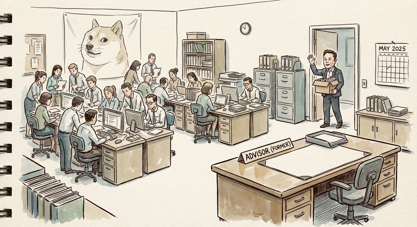
By May 2025, Elon Musk stepped back from his formal advisory role at DOGE. That raised its own set of questions. Had he accomplished what he set out to do? Was he moving on to other projects? The official story was that the office would continue operating under administration direction. The practical story was a bit more modest: DOGE was now running with fewer than 50 people instead of the larger advisory apparatus assembled in the early months.

Despite the personnel reduction and leadership change, DOGE didn’t disappear. The office kept functioning. That tells us something. Whatever debate surrounds specific initiatives or claimed savings, the appetite for government efficiency work persists across the administration. The question for citizens, though, is whether that work is happening with the transparency and accountability that democracy requires.

The Accountability Question: Where Do We Stand?

This is the through-line for evaluating DOGE’s first year. Claimed savings versus realized savings is important. Payroll reductions versus service quality is important. But underlying both is a fundamental democratic question: how much visibility do citizens have into what’s happening?

The court injunctions matter not because they necessarily stopped important work, but because they reflect a collision between executive action and statutory safeguards. Those safeguards exist for reasons. They make sure that when government changes how it operates, it does so with appropriate checks and balances. When courts are issuing injunctions against access to payment systems, that’s a signal that the normal democratic guardrails are engaging. That’s not always pretty. It’s not always efficient. But it’s usually necessary.

For a more systematic dive into what happened, the Brookings Institution DOGE Accountability Review offers detailed analysis of how the initiative unfolded and what it means for government reform going forward.

What We Actually Learned

After one year, here’s what’s clear. Government does have waste. Finding it isn’t magic. It requires serious analysis, good data, and people willing to ask hard questions. DOGE did some of that. Whether it did so responsibly, transparently, and with appropriate oversight is where reasonable people disagree.

The $100 billion in identified savings probably included some real opportunities. The CBO’s lower projections for realized savings probably reflect both accounting differences and genuine implementation challenges. The 75,000 federal workers who left took real expertise with them. And the courts’ willingness to restrict DOGE’s data access signals that democratic institutions are still functioning, even if imperfectly.

The bigger lesson? Government reform is hard. Cutting costs and maintaining service quality aren’t always the same thing, and anyone telling you otherwise is selling something. Real reform requires balancing efficiency with accountability, and it requires citizens who understand enough of this complexity to ask smart questions of their elected representatives.

What’s your take on how DOGE’s first year played out? Have you tracked specific efficiency initiatives in your own region or sector? The conversation about how government should work is everyone’s responsibility. I’d genuinely like to know what you’re seeing in your community.

Syria After Assad: Reading the Six-Month Report Card Like a Civics Detective

December 8, 2024: When History Pivots

Let’s start with the date that changed everything. On December 8, 2024, forces led by Hayat Tahrir al-Sham swept into Damascus and ended Bashar al-Assad’s 24-year grip on power. The dictator fled. He’s now in Moscow, where Russia granted him asylum. That’s the headline. But what I find fascinating is how quickly the world’s powers repositioned themselves. This wasn’t a slow transition. It was sudden. Chaotic. Real.

Why does this matter beyond the immediate drama? Because moments like this teach us something crucial about international relations. Transitions matter more than revolutions. Anyone can topple a regime. The question that actually matters is what comes next. Can you build something better? Can you hold it together? Can you do it while every neighboring power tries to pull you in a different direction?

The Ahmed al-Sharaa Question: Rebranding as Governance

In January 2025, Ahmed al-Sharaa was named head of a transitional governing body. You might know him by his former nom de guerre, Abu Mohammad al-Jolani. Here’s where it gets complicated, and I mean that in the most pedagogically honest way. Al-Sharaa is still on the UN Security Council’s sanctions list. He pledged inclusive governance. Both things are true simultaneously. This isn’t a plot hole. It’s reality.

Think about historical parallels for a moment. Nelson Mandela negotiated with P.W. Botha’s apartheid government while still branded a terrorist. Ho Chi Minh had worked with the French before fighting them. History is full of leaders who were enemies before they became statesmen. The shift doesn’t erase the past. It doesn’t make the past acceptable. But it does illustrate something we need to understand: transitions require bridge-builders, even imperfect ones.

Al-Sharaa’s challenge is real. He needs to assure Syrian minorities that they won’t be marginalized. He needs to convince international powers that he’s serious about inclusive rule. He needs to do this while staying on a terrorist watch list. The message he’s sending is: “I’m not the person I was, but I’m also not asking anyone to forget who I was.” That’s pragmatism. Whether it works is the actual question.

The Turkey Card: Economic Partnership and Regional Stakes

Turkey moved fast. That’s the thing about regional powers. When the board shifts, they act. By March 2025, Turkey had signed a preliminary cooperation framework with Damascus. Turkey backed key rebel factions during the civil war, so this wasn’t a surprise pivot. It was a logical consolidation of influence.

Here’s the geopolitical math: Turkey has a 910-kilometer border with Syria. Ankara has legitimate security concerns about Kurdish groups, refugee overflow, and regional stability. An HTS-led government aligned with Turkish interests serves Turkish goals. But it also serves Syrian reconstruction goals if managed well. Economic partnership with Turkey means trade, infrastructure investment, and employment. That matters for a country trying to rebuild.

The question worth asking: Can economic interdependence actually work as a force for stability? Or does it just mean Turkey has leverage over Syria’s domestic choices? History suggests the answer is both. Poland’s economic ties to Western Europe didn’t erase Polish sovereignty. But they did constrain certain policy choices. Context is everything.

The American Pivot: Sanctions Ambiguity and Diplomatic Realism

In January 2025, the United States suspended the $10 million reward for al-Sharaa’s capture. That’s not nothing. That’s a signal. The U.S. also engaged in direct diplomatic contacts with the transitional authorities. But here’s the part that shows Washington’s actual hesitation: formal sanctions relief remained partial as of early 2026.

This is diplomatic hedging at its finest. The Americans are saying, “We’re willing to work with you, but we’re not fully betting on you yet.” That’s actually wise. Why? Because Syria’s transition is unstable. Seven-point-two million Syrians were internally displaced as of mid-2025. Refugee return rates from Turkey and Lebanon were slower than anyone projected. You can’t build stable governance when millions of your citizens are scattered across three countries. The Americans know this. So they’re moving slowly. They’re testing. They’re documenting.

Check out the UN OCHA: Syria Humanitarian Situation Reports 2025 if you want to see the actual numbers. These aren’t abstract statistics. These are people. Families. Communities that can’t return home because home isn’t safe yet. American caution makes sense in this context.

The Stability Test: What Six Months Actually Tells Us

Here’s what I’m watching closely. Transitions rarely fail in month one. They fail in month eighteen. They fail when the initial revolutionary enthusiasm collides with the boring, unglamorous work of actual governance. Schools need teachers. Hospitals need supplies. Electricity grids need maintenance. That’s where most transitions crack.

Al-Sharaa’s government has managed the basics so far. No immediate collapse. No humanitarian catastrophe beyond what already existed. But read Carnegie Middle East Center: Syria’s Post-Transition Governance to see what analysts are actually worried about. Spoiler: it’s the medium term.

The geopolitical competition for influence is real. Turkey wants economic leverage. Russia wants to keep its Mediterranean bases and its Syrian client status. The U.S. wants to prevent regional destabilization and counter Iranian influence. Each power will push. Each power will test boundaries. Syria’s transitional authorities have to navigate all of this while actually trying to govern a broken country.

The historical parallel I keep returning to is the Balkans in the 1990s. International powers intervened. Local actors tried to build new governments. Some succeeded. Some didn’t. The difference came down to whether local leadership could deliver basic stability while resisting pressure to take sides in proxy conflicts. It’s possible. It’s just hard.

What We Should Be Watching

Don’t wait for the big moment. Watch the small ones. Watch whether schools reopen. Watch whether minority communities report feeling safe. Watch whether refugees start returning in meaningful numbers. Watch whether al-Sharaa’s government can actually regulate the extremist groups still operating in Syrian territory. Watch whether corruption gets addressed or just repositioned. These are the real metrics.

Six months is a moment in history. It’s not a verdict. But it’s enough to see whether the trajectory is real. Enough to see whether this transition has built any actual institutional foundation. Enough to start asking serious questions about what comes next.

What do you think matters most in Syria’s transition right now? What outcome would you actually want to see happen over the next two years? These aren’t rhetorical questions. They’re invitations to think seriously about what stability actually requires and whether the international community is willing to support it.

Project 2025’s Implementation Scorecard: Where the Blueprint Met Reality

The Grand Design Meets Institutional Friction

Here’s what I find genuinely fascinating about watching major policy initiatives unfold: they never land exactly as designed. The Heritage Foundation’s Project 2025 Mandate for Leadership was ambitious, comprehensive, and startlingly detailed. At 887 pages, it represented thousands of hours of conservative policy work, outlining a clear vision for executive branch transformation. But between “here’s the plan” and “policy implemented” sits something messy and real: the actual machinery of government. Institutions push back. Laws create friction. Congress doesn’t always cooperate. And sometimes, the people doing the work find creative ways to resist change.

Project 2025's Implementation Scorecard: Where the Blueprint Met Reality
Project 2025’s Implementation Scorecard: Where the Blueprint Met Reality

So what actually happened when the administration attempted to translate Project 2025 into governing reality? That’s the question worth asking if you care about how power actually works in democracies. Not whether you liked the ideas, but whether they survived contact with the structural constraints of our system.

Illustration for Project 2025's Implementation Scorecard: Where the Blueprint Met Reality
Illustration for Project 2025’s Implementation Scorecard: Where the Blueprint Met Reality

Schedule F: The Template That Worked (Sort Of)

Let’s start with the clearest implementation win for Project 2025’s architects: the revival of Schedule F. This executive order, signed on January 20, 2025, fundamentally altered employment classifications for federal civil servants. The plan called for reclassifying tens of thousands of federal positions out of traditional civil service protections and into at-will categories, giving the executive branch more hiring and firing flexibility.

It happened. The Office of Personnel Management documented that roughly 50,000 federal positions were affected by Schedule F reclassification in the first half of 2025. That’s not theoretical. That’s real people whose job security changed overnight. The implementation succeeded because it relied on executive power alone. No Congressional approval needed. No committee hearings. Just the President’s authority over federal employment.

But here’s where reality gets complicated: legal challenges from federal employee unions immediately moved through multiple circuit courts. The policy worked as implemented, but its long-term survival remains uncertain. A lower court decision against the administration, an appeal, and we’re right back in litigation hell. The point isn’t that the policy failed to launch. It’s that implementation and actual durability are two different things. You can activate a policy. You can affect thousands of people with it. But if courts ultimately strike it down, did it really succeed? That’s still an open question.

The Department of Education: Executive Action Hits a Senate Wall

Now let’s look at what didn’t work, or worked only partially. The elimination of the Department of Education was a centerpiece of Project 2025’s education strategy, a goal that’s animated conservative policy circles for decades. It seems simple enough: if the President wants to dismantle an agency, can’t he just do it?

No. That’s the answer. Not unilaterally. The Department of Education was created by statute. Eliminating it requires Congressional action. And here’s where Senate math matters more than executive ambition. Despite Republican control, the cloture threshold of 60 votes stood in the way. The legislation needed to eliminate the agency couldn’t command that supermajority. Republican senators had different priorities or concerns about education policy in their states. The effort to pass elimination legislation faced procedural obstacles that proved insurmountable. Project 2025 wanted this. It didn’t happen. Not for lack of trying, but because the Constitution’s Senate rules made it impossible.

This tells you something important about how American government actually works. You can be ideologically aligned. You can control the executive branch. You can hold the majority in both chambers. And you still can’t unilaterally reshape institutions that are embedded in statute. The founders knew what they were doing with those checks and balances.

The Broader Implementation Picture: 40 Percent and Counting

So where do we land with Project 2025 overall? The Brookings Institution Governance Studies Federal Workforce Analysis published a March 2025 assessment worth sitting with. Approximately 40 percent of the project’s first-year federal agency restructuring recommendations had been partially or fully attempted via executive action. Forty percent. Not a complete washout. Not a full victory either. More like: they got the easier stuff done, and now they’re stuck on the harder parts.

What constitutes “partial” or “full” implementation matters here. The administration could reorganize staffing within agencies, redirect regulatory priorities, and issue new guidance to career staff. All of that counts as implementation because it actually affects how government operates. But creating new agencies or eliminating old ones? Redirecting funding streams authorized by Congress? Those require legislative action that didn’t materialize as planned.

The DOGE-linked efficiency reviews generated real effects on federal employment. According to data compiled by the Partnership for Public Service Federal Workforce Data, federal employee attrition at agencies targeted by these reviews ran at nearly triple the historical baseline rate during the first half of 2025. People were leaving. Institutional knowledge was walking out the door. Whether that constitutes successful “reform” or dysfunctional government depends entirely on your starting premises.

What This Teaches Us About Power and Resistance

Here’s what I think matters most for understanding how change actually happens in American governance. Project 2025 was detailed and serious. It had competent people behind it. It had executive authority and partisan control. And yet: it faced limits. Some policies worked because they required only executive power. Others stalled because Congress wouldn’t cooperate, even when Congress was controlled by the same party. Some succeeded in launching but face legal jeopardy that will determine their actual durability.

This is neither cause for despair nor celebration, depending on your politics. It’s simply how the system functions. Ambitious initiatives face friction. Institutional resistance is real. Courts matter. Senate procedures matter. Career civil servants, even with their newfound at-will status, still have choices about whether to stay or go. The machinery of government isn’t frictionless, and honestly, that’s the design working as intended.

I want to know what you’re seeing in your own communities and institutions. Are federal changes trickling down to local implementation? Are your state agencies responding to restructuring? Are your neighbors who work in federal jobs talking about changes in their workplaces? The real story isn’t what got announced. It’s what’s actually changing the way services get delivered. That’s where democratic accountability lives. Drop a note in the comments and let’s compare notes on what’s real versus what’s rhetoric.

Sudan’s Civil War at Year Three: Why the World’s Fastest-Growing Humanitarian Catastrophe Remains a Diplomatic Blind Spot

When 12 Million People Disappear from the News Cycle

Here’s something that should keep you up at night: by early 2026, more than 12 million Sudanese people had been forced from their homes. That’s not a typo. That’s the largest internal displacement crisis on the planet right now, according to UNHCR data. To put it in perspective, it’s roughly equivalent to the entire population of Ohio becoming refugees in their own country.

Sudan's Civil War at Year Three: Why the World's Fastest-Growing Humanitarian Catastrophe Remains a Diplomatic Blind Spot
Sudan’s Civil War at Year Three: Why the World’s Fastest-Growing Humanitarian Catastrophe Remains a Diplomatic Blind Spot

The armed conflict between the Sudanese Armed Forces and the Rapid Support Forces, which exploded in April 2023, has now ground on for three years. Three years. And most of us could barely tell you what sparked it or who the major players are.

Why? Because Sudan’s catastrophe has become invisible in real time. A 2025 analysis by Reuters Institute researchers found that Sudan’s war received roughly 90 percent less international media coverage than the Israel-Gaza conflict, despite comparable or higher casualty estimates. Think about that math. The same atrocities, the same scale of human suffering, but one story gets wall-to-wall coverage while the other becomes background noise. That’s not an accident. That’s a choice.

The Numbers That Should Make You Angry

Let’s ground this in specifics because abstractions don’t move policy. More than half of Sudan’s population—over 25 million people—faced acute food insecurity by late 2025, according to UN OCHA estimates. Not hunger. Acute food insecurity. That’s the clinical term for “I don’t know if my children will eat tomorrow.” Famine conditions have already been confirmed in multiple regions.

If you want to understand what that actually means on the ground, check the UNHCR Sudan emergency situation overview and the UN OCHA Sudan humanitarian response plan and data. The numbers are staggering, but what’s worse is the gap between what’s needed and what’s being delivered. Humanitarian access is collapsing. Aid convoys are being blocked or looted. Healthcare systems have essentially ceased to exist in conflict zones.

What makes this different from other humanitarian crises? The deliberateness of it. This isn’t just tragic collateral damage of war. Reports indicate that food has been weaponized. Water systems have been destroyed. Healthcare facilities have been targeted. When you combine systematic destruction with a media blackout, you get what we have now: a slow-motion catastrophe that the world is collectively choosing not to watch.

The Diplomatic Theater Nobody’s Watching

Here’s where it gets darkly funny, if there’s anything funny about 25 million people facing starvation. In mid-2025, the African Union actually managed to produce a framework agreement in Addis Ababa. Both sides nominally signed on. It looked like progress. It looked like maybe, just maybe, the international community could broker peace.

Then both parties violated it within weeks. AU monitoring reports document this. Not ambiguously. Not in contested ways. Both the Sudanese Armed Forces and the Rapid Support Forces broke their commitments almost immediately. And what happened? The international response was basically a shrug. No consequences. No real pressure. Just another failed agreement filed away in the diplomatic archive.

This matters because it tells you something crucial about how international relations actually work versus how we teach it in civics class. Treaties, frameworks, agreements, they’re only as strong as the enforcement mechanisms behind them. When there’s no political will to enforce them, when no powerful nation has a compelling national interest at stake, they become performance art. A way for the international community to feel like it’s doing something while doing nothing.

Follow the Arms. Follow the Money. Follow the Power.

Want to understand why the fighting continues? Follow the weapons. A December 2024 UN Panel of Experts report documented that the Rapid Support Forces, led by General Mohamed Hamdan Dagalo, commonly known as Hemedti, have received significant documented arms flows from the UAE. This wasn’t speculation or anonymous sourcing. This was documented, verified evidence presented to the Security Council.

The Security Council declined to formally act on it. Read that sentence again. The UN’s main enforcement body saw evidence of a permanent member’s ally fueling a war that’s created the world’s largest refugee crisis, and decided not to formally respond. Not because the evidence was weak. Not because the allegation was disputed. But because geopolitical interests took priority over humanitarian crisis.

This is how international power actually works. The RSF wouldn’t be able to sustain military operations without external support. That support exists because certain countries find it strategically useful. So the war continues. The displacement continues. The starvation continues. And the diplomatic dance continues around it all.

Why This Matters to Your City Council Meeting

You might be thinking: “This is all very interesting, but I’m just a person trying to stay informed about my local community. Why does Sudanese geopolitics matter to me?”

Fair question. Here’s the practical answer: the way your government responds to crises abroad tells you something about how it will respond to crises at home. It tells you about priorities. About how much pressure is needed to move decision-makers. About whether humanitarian concerns matter when they compete with strategic interests.

When we collectively accept that a crisis affecting 37 million people can be ignored, we’re setting a standard. We’re teaching our leaders that they can make these kinds of choices without consequence. We’re normalizing the idea that some suffering is worth paying attention to and some is acceptable to ignore.

The research is clear on this: attention drives resources. Media coverage correlates directly with humanitarian funding. Donor governments respond to domestic pressure. So when Sudan gets 90 percent less coverage than Gaza, it gets a fraction of the resources. It becomes invisible. And invisible crises get worse.

What Actually Changes This

So what’s the move? Start where all actual change starts: with information and attention. Read beyond the headlines. Check what organizations like UNHCR and UN OCHA are actually saying about Sudan. Share what you learn. Ask your representatives why this crisis isn’t being talked about. Not in an accusatory way. Just genuinely ask: “Why do you think Sudan’s getting so much less media coverage than other conflicts?” Make them think about it.

This is the unsexy part of civic engagement. It’s not a march or a protest, though those can help too. It’s just paying attention. Asking questions. Making sure the people you’ve elected know that you know what’s happening and you care that they address it.

Sudan’s humanitarian catastrophe didn’t happen because of bad luck or natural disaster. It happened because specific decisions were made by specific people. Other specific people can make different decisions if they face enough pressure to do so. That pressure starts with you deciding this matters and telling someone else about it.

Ranked-Choice Voting Just Had Its Biggest Year Yet — Here’s the Precinct-Level Proof That It Changes Who Runs for Office

The Numbers Don’t Lie: RCV’s Explosive Growth in 2024-2025

Here’s something that should make you sit up and pay attention. In just three years, ranked-choice voting expanded from affecting 8 million eligible voters to over 13 million. That’s a 62% increase. By January 2026, voters across 17 states plus Washington D.C. were casting ballots under a fundamentally different system than the plurality voting most Americans have known their entire lives.

Ranked-Choice Voting Just Had Its Biggest Year Yet — Here's the Precinct-Level Proof That It Changes Who Runs for Office
Ranked-Choice Voting Just Had Its Biggest Year Yet — Here’s the Precinct-Level Proof That It Changes Who Runs for Office

Nevada’s approval of Ballot Question 3 in November 2024 alone represents the single largest statewide RCV expansion in U.S. history. Portland, Oregon implemented a brand new multi-member district RCV system for city council elections that same month, electing a full 12 council members from four geographic districts under the new rules. These weren’t quiet policy shifts. These were major metropolitan areas and entire states saying yes to electoral reform.

If you’re wondering whether this matters beyond the civic satisfaction of knowing your voting system is more mathematically elegant, the answer is absolutely yes. The proof is getting specific enough that we can’t hand-wave it away anymore.

Illustration for Ranked-Choice Voting Just Had Its Biggest Year Yet — Here's the Precinct-Level Proof That It Changes Who Runs for Office
Illustration for Ranked-Choice Voting Just Had Its Biggest Year Yet — Here’s the Precinct-Level Proof That It Changes Who Runs for Office

The Candidate Pipeline Changed: Who Actually Runs Matters

Here’s the part that matters for actual governance. When Alaska ran its first congressional elections under ranked-choice voting in 2024, something measurable happened. Non-major party candidates qualified for general election ballots at a 6.2 percentage point higher rate than they had in 2020 under the old system. That’s not massive. But it’s real. It’s statistically significant. It means different people are running for office.

Think about that for a moment. The voting system itself changed the composition of the candidate field. Not through some indirect cultural shift. Through the mechanical properties of how ballots work. In a plurality system, a third-party candidate is often treated as a spoiler. Voters fear “wasting” their vote. In a ranked-choice system, you can express your genuine first preference without that fear because your vote moves to your second choice if your first choice doesn’t win. Candidates see that possibility. They run.

The MIT Election Data and Science Lab released research in 2025 documenting another shift in the candidate pipeline. Ranked-choice voting jurisdictions showed a 19% higher rate of women candidates advancing past primary stages compared to traditional plurality systems. Again, this is mechanical. Women candidates, who often face steeper fundraising challenges and media barriers, benefit when the system doesn’t create artificial spoiler dynamics that pressure voters toward major-party nominees.

Yes, But Does It Actually Change Representation? The Honest Answer

I want to be fair to the skeptics here because they have a point worth grappling with. More candidates running doesn’t automatically equal better governance. Portland’s new 12-member council structure combined with ranked-choice voting will need time to actually govern. The Alaska congressional results were fascinating but represent one election cycle. We don’t have five years of outcome data yet showing that these candidates actually legislated differently or that their presence changed policy priorities.

The tension is real. Electoral reform advocates point to structural changes in who participates. Critics point out that changing the ballot doesn’t change the fundamental constraints of legislative districts, campaign finance, or partisan polarization. Both observations are true. A ranked-choice voting system can reduce spoiler dynamics and encourage diverse candidacies. It cannot, by itself, make ideological opponents vote together or eliminate winner-take-all incentives in single-winner races.

What we’re seeing in 2024-2025 is that ranked-choice voting accomplishes one specific, measurable thing: it changes which candidates believe they have a viable path to elected office. Whether that leads to meaningfully different governance depends on what those candidates actually do once they win. That’s the question we’re going to spend the next few years answering.

The Precinct-Level Reality: Where This Gets Concrete

The real value of looking at precinct-level data is seeing that this isn’t abstract reform anymore. Check the FairVote RCV Election Results Database if you want to drill down into specific races. You can see exactly where ranked-choice voting changed the outcome. You can see where a candidate won with 38% of first-choice votes but built a coalition through ranked preferences. You can see precincts where the winner would have been different under plurality voting.

Portland’s November 2024 election offers the most recent large-scale example. For the first time, multiple candidates were elected to represent each district. Some of those elected officials received less than 50% of first-choice votes but built sufficient ranked-choice coalitions to win. Others won with strong first-preference support. The diversity of outcomes is exactly what you’d expect from a system that doesn’t force a false binary.

This is why looking at specific elections matters more than abstract debate. You can see it working. Or not working. Depending on your perspective. But you can see it.

Where We Actually Are: The Moment Matters

We’re at an inflection point. Ranked-choice voting went from being a reform proposal debated in political science seminars to the actual voting method for over 13 million Americans. That shift happened in three years. The next phase is whether this expands, stabilizes, or contracts, and that depends entirely on what happens in the places that have already implemented it.

If you’re genuinely interested in understanding how electoral systems affect who runs for office and what gets represented in democratic institutions, the research is increasingly available. The MIT Election Data and Science Lab: Ranked Choice Voting Research offers rigorous analysis. FairVote tracks implementation and outcomes. Local election officials in Alaska, Nevada, Portland, and other RCV jurisdictions are collecting actual data.

The evidence suggests one clear thing: ranked-choice voting does change the candidate pipeline. Whether you think that’s beneficial depends on whether you believe the current two-party candidate filter is working as intended. But the factual claim that it changes who runs for office? That’s not debatable anymore. We have precinct-level proof. The harder question, the one we’ll be answering over the next several election cycles, is whether those different candidates actually govern differently. That’s the conversation worth having next.

Page 6 of 9